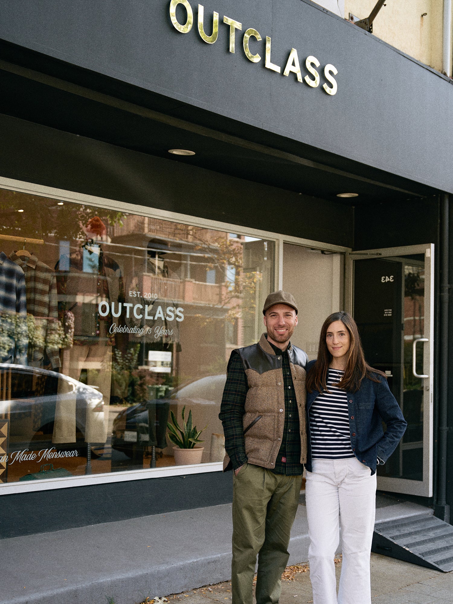
Last fall, we began a rebrand to mark 15 years of Outclass. It was an opportunity to honour our past while embracing the future. Much has changed over the years, but our core values remain the same: creating quality-driven pieces, made entirely in Canada

For Matteo, this rebrand was a full-circle moment. Having started his creative journey at OCAD, he dusted off his graphic design skills to lead the visual refresh. Along the way, he collaborated with OCAD intern Jiordan Roque, who hand-drew our new loon label. It was the perfect opportunity to mentor the next generation while building on our heritage.

The new outerwear labels now feature a hand-drawn landscape with a lake, loon, and hills in the background. We’ve also introduced a signature burgundy, inspired by vintage TTC logos and the colour of old streetcars. A reference to Toronto's history, reimagined for today.

To carry forward our heritage, we’ve kept our original crest logo from 2010, now in burgundy. You’ll find it on our placket labels and hangtags, where the enlarged, transferred design adds a subtle vintage character.

Through these updates, Outclass remains what it has always been: timeless, Canadian-made, and deeply rooted in its origins. Thank you for being part of our journey over the past 15 years!
